Improve Readability and Visual Connection
Most Americans read at a sixth-grade level (source)—yet too many marketing campaigns use language that’s overly complex. If a message takes too much effort to understand, people tune out. Plain, direct language always wins.
Start with strong, clear writing:
- Use simple, everyday words.
- Keep sentences short.
- Cut out jargon and acronyms.
- Write the way people talk.
Tip: Reading your copy out loud takes time—but it works. If it sounds awkward, it probably reads that way too.
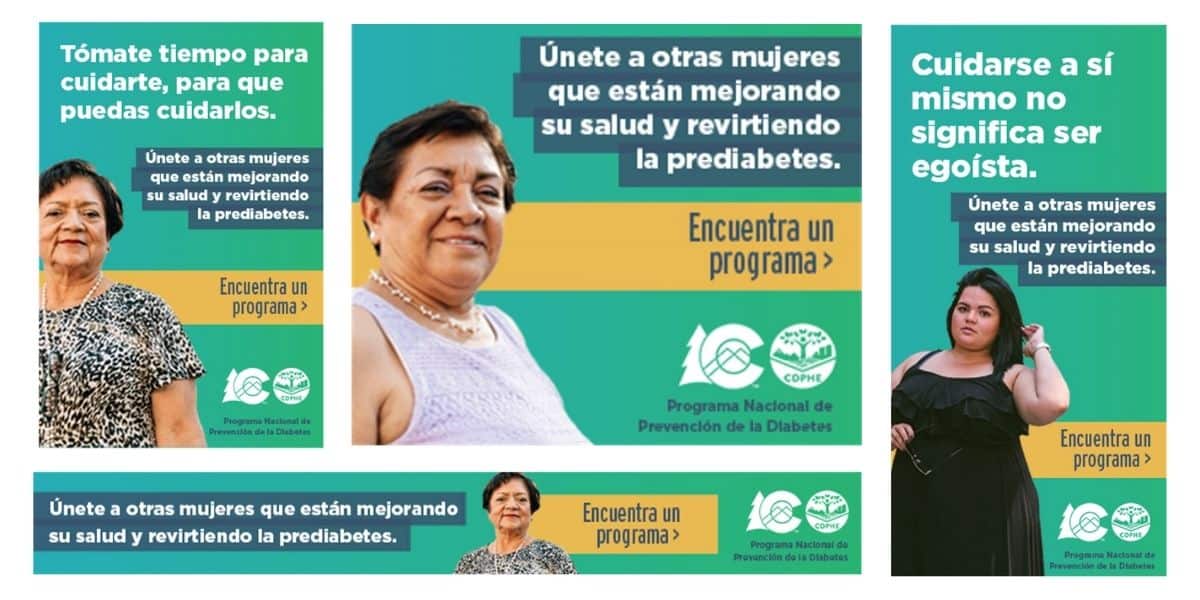
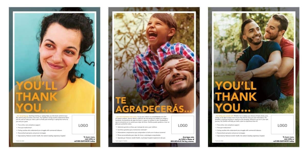
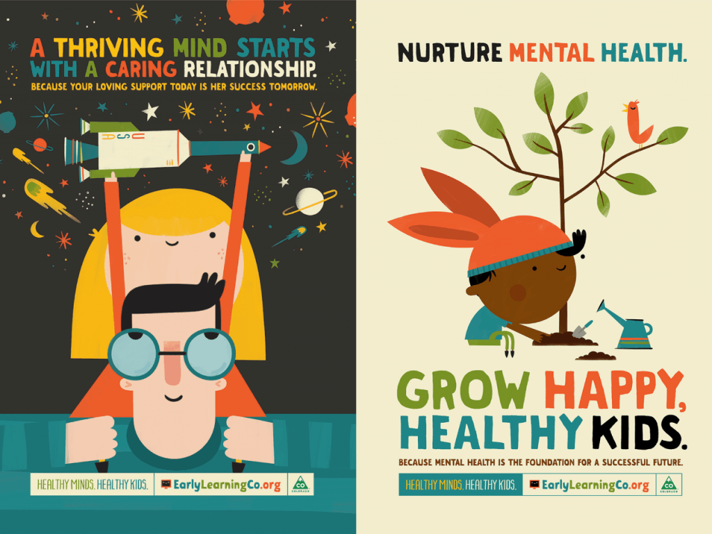
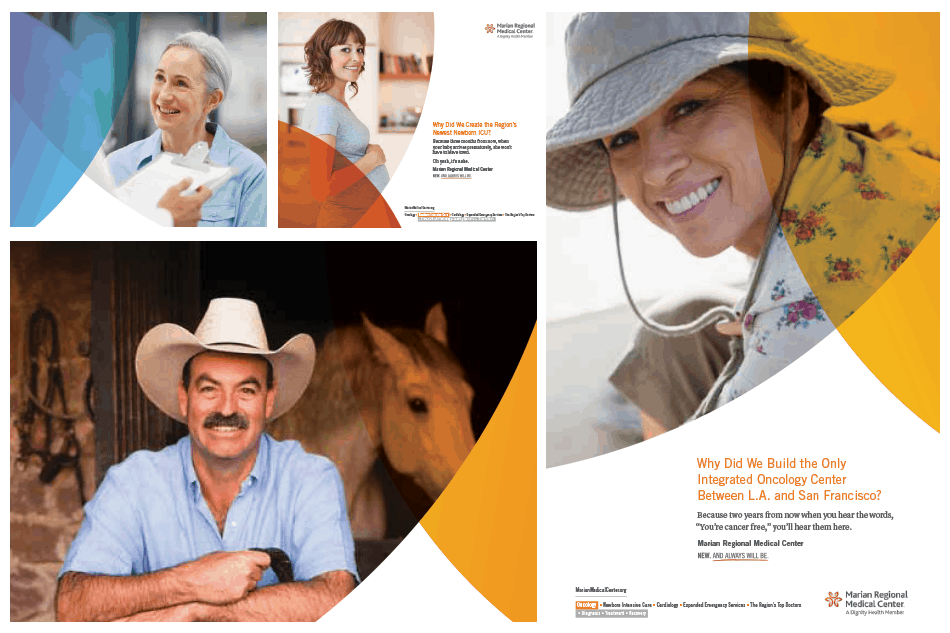
Use visuals that support the story—not distract from it.
People want to see themselves—or people like them. Choose images that feel real and add meaning. Skip anything that adds clutter or confusion. And of course avoid cheesy stock photos that look staged.
- Make It Visually Accessible: Design choices can either include or exclude people. Accessibility helps everyone, especially people with vision impairments, learning differences, or just aging eyes.
- Use high-contrast colors: Black text on a white background remains one of the most readable combinations. Avoid light gray text, bright yellow text, or text over busy images. Use a contrast checker (like WebAIM) to confirm your design meets WCAG (Web Content Accessibility Guidelines) standards.
- Pick readable fonts—and size them up: Use sans serif fonts like Arial, Helvetica, or Verdana. Keep body text at least 16 point font. For printed materials, 12-point font or larger works best.
- Avoid ALL CAPS and italics: All caps slows reading speed. Italics can blur on screen. Use bold type for emphasis instead.
- Break up the page: Add white space between lines and sections. Use headers, bullet points, and short paragraphs. This keeps readers engaged and prevents overwhelm.
Go Beyond Compliance: Design with People in Mind
Accessible content isn’t just a box to check—it’s a mindset. We build stronger campaigns when we center them around the needs of the people we’re trying to reach.
More accessibility tips:
- Add image alt text for screen readers.
- Open caption videos.
- Avoid flashing elements.
- Write descriptive link text (“Read more about accessible design” beats “Click here”).
- Test your content with real users, not just internal teams.
Accessibility Is Good Strategy
When you make your message easier to understand, you expand your reach. It brings more people in, keeps them engaged, and shows you care enough to meet them where they are.
Want help building a more accessible campaign? Let’s talk.